Data to the rescue: Visualizing water quality in your community
Summary
This engaging series of lessons is designed for students to learn about statistics while becoming water stewards. Throughout the activities, students will explore water quality parameters such as temperature and dissolved oxygen, analyze changes over time, and understand the impact of human activities on water quality.
All of our lessons are designed with two parts — an in-classroom and a field component. You can choose to do the lessons in succession over multiple days, at a convenient time, or teach either part as a standalone lesson. The activities are presented as small group activities to facilitate collaboration and active participation. At the bottom of the page, you will find a section on ocean and real-world connections, downloadable slides, student handouts, a printable version of the in-classroom activity, and a glossary of terms.
This series of activities was designed as part of NSERC’s 2022 Science Literacy Week and funded by a PromoScience grant. We gratefully acknowledge NSERC’s support. Let’s dive in!
Recommended grades
These activities are recommended for grades 4 to 8. The extension questions and activities are appropriate for students in grades 8-10 or for advanced students in earlier grades.
Learning outcomes
- Interpret water quality data using graphs and tables.
- Analyze water quality data to identify trends, patterns, and relationships.
- Create a graph using historical water quality data.
- Conduct water quality testing using Water Rangers equipment.
- Discuss the impacts of human activities on water quality.
Background
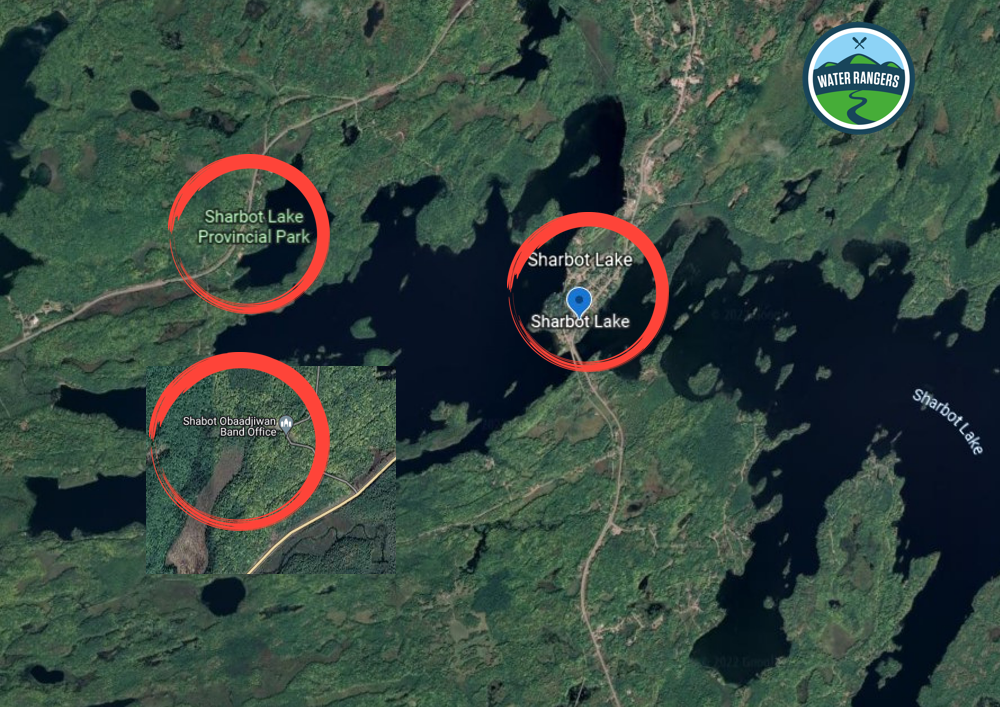
Water quality is essential for the health of our communities and ecosystems. For the in-classroom activities, students will focus on Sharbot Lake, Ontario, where community scientists have collected valuable data on water quality parameters. By examining this data, students will gain insights into how different factors affect water quality in their own communities.
Investigating Sharbot Lake data
Location: In the classroom
Duration: 25 minutes for each activity
Objective: Engage in a series of activities that build on skills in interpreting and analyzing data. Activities can be completed over five consecutive days, or they can be extended into a longer period of time.
Materials needed
- Presentation slides
- Student handouts
- Note taking materials
Part 1: Introducing Sharbot Lake
Guiding question: How is water affected by human activity?
Introduction (5-10 minutes)
Teachers will introduce students to Sharbot Lake by discussing the region around the water. Work through the slides provided and use the speaker notes below each slide as guiding prompts for discussion.
For the activity, teachers will focus on three communities around the lake:
- The town & cottages
- The provincial park
- The Shabot Obaadjiwan First Nation
Body (10-15 minutes)
Continue with the slides. Expand on each community with pictures and some background.
- The town of Sharbot Lake was built around an old railway. The cottages use water for fishing and leisure.
- The Provincial park has been around since the 1950s, focusing on protection and conservation of land.
- The Shabot Obaadjiwan, part of the Algonquin Nation, have been around since at least 3,000 BCE. They successfully opposed a uranium mining venture in 2008.
Distribute a one-page handout for Part 1. Ask the students: How could each community negatively or positively affect the water of Sharbot Lake? Some prompts for the students are written on the slides and their handout.
- Students will think-pair-share in groups of 2-3, then join another group to compare answers (written on their handout).
- Students can share their results with the class if comfortable.
Next, show the graph of water temperature in Sharbot Lake (West basin) to students, point out features including x and y axis and units, etc. Ask the next question set to student groups:
- What are some things you notice about the graph?
- What is something you are wondering about the data you see?
- What do you think the data may look like in 5 years? Why?
Conclusion (5 minutes)
Wrap up the activity by explaining that you will go into more detail about the data tomorrow.
Collect written answers from groups and use these as an exit card to inform the discussion with students for the next parts.
Extension questions
- Looking at the graph, do you notice any trends (i.e. change over time) in the data?
- What factors may have affected the temperature of Sharbot Lake since 2001?
Part 2: Describing data with statistics
Guiding question: How can we describe data by using statistics like mean and range?
Introduction (5 minutes)
Refresh students on Part 1’s material briefly and respond to any questions or ideas in their notes collected.
For Part 2, you will be using water quality data to see how Sharbot Lake has changed over time. Show students the temperature bar graph from Part 1 again (refer to the slides for Part 2). Ask the class verbally:
- How can we learn more details about the temperature of Sharbot Lake?
- What is the time range of the data?
- How many observations are there?
Time for calculations! To learn about how the temperature data at Sharbot Lake are changing, we need to use math!
Body (5-10 minutes)
Hand out worksheets for Part 2. Make sure that the graph and water temperature tables are visible on a projector for students to refer to (see the slides for Part 2).
Break students into 3 groups. In these three groups, students will calculate the mean or the range of data within three sets of years (2001-2011, 2017-2018, 2019-2022).
Teacher tip!
Be prepared to take more time here, given the amount of values students will be working with. Breaking up students into groups based on where they are sitting may be easiest, but note that some groups will have to do a few more calculations. You can also remove decimals from the tables for grades who have not tackled decimal numbers yet.
Encourage group mindset where students help each other with the calculations!
Conclusion (5 minutes)
Wrap up instruction by working with students to develop conclusory statements, such as:
- “Therefore, the mean of the water temperature at Sharbot Lake between 2001-2011 is 19.4 degrees Celsius”.
- “Therefore, the range of water temperature data at Sharbot Lake from 2017-2018 was 18.2 degrees, which is 2.8 degrees greater than the range from 2001-2011”.
Extension questions
- Do you notice any outliers (data points that are very different from the others) in the tables? What may have caused them?
- How would the mean change if we removed these outliers?
- How would the range change if we removed these outliers?
Part 3: Interpreting graphs and trend lines
Guiding question: How can we visualize changes over time in data?
Introduction (5 minutes)
Begin by returning to the mean and range calculations from Part 2. Draw attention to the answers that students found, particularly if changes are happening over time, such as:
“From 2001-2011, the mean (average value) of the water temperature at Sharbot Lake was 19.4 degrees Celsius. From 2019-2022, the mean is now 21.4 degrees. What has happened here?”
Next, show the temperature over time graph again (refer to slides for Part 3). Ask the class: “What did you see changing as time goes on?”
Body (5-10 minutes)
“Let’s explore a way that we can better see change over time in the temperature of Sharbot Lake”.
Now, show the same temperature graph, but with an added trend line (slides for Part 3). Ask students what they think this line means. Clarify and expand on their answers.
Now, distribute the student handouts for Part 3. Have students work through the handouts either independently or in small groups, as you see fit.
Conclusion (5 minutes)
Once again, collect student handouts and use students’ answers to inform your thinking going forward.
The activity asks students to think about the future consequences of gradual climate change. With time, explore the causes and consequences of climate change within freshwater bodies. Perhaps loop back in prior knowledge students may have about climate change in previous grades. Connect climate change with local and national issues, such as mining, industrialization, and pollution.
Extension questions
- What can we learn from the trend line in the graph above that we couldn’t learn from the bars?
- Given the trend line above, what water temperature would you expect to observe in 1995? In 2030?
- How do you think outliers affect the trend line?
Part 4: Comparing two sets of data
Guiding question: What patterns can we see by comparing two sets of data?
Introduction (5 minutes)
See the slides for Part 4.
This section works with a new type of water quality parameter: dissolved oxygen.
Highlight that as dissolved oxygen drops, life in freshwater will struggle to cope. Fish spawn will be unsuccessful, competition for resources more difficult, and in extreme cases, fish and other animals will suffocate and die.
Learn more about dissolved oxygen.
Body (5-10 minutes)
Distribute handouts for Part 4. Show students the dissolved oxygen graph. Ask questions 1 and 2 verbally to the whole class.
- In the graph below, when is the lowest recorded dissolved oxygen reading? When is the highest?
- What do you think will happen by the 2030s? What is the lowest value that dissolved oxygen might reach? What might bd the consequences for aquatic life?
After hearing out and prompting for responses from students, have them write a few answers, or their peer’s answers down.
Next, show students the double bar graph on the slides. Have students think-pair-share with a partner for questions 1 and 2.
- In the graph below, how are water temperature and dissolved oxygen changing over time? Why do you think that might be?
- What does the graph below suggest about the relationship between water temperature and dissolved oxygen? Do you think one may influence the other?
- You can explain that warmer water retains less oxygen (because warmer water molecules move faster, thereby letting oxygen escape). Warmer water can also lead to algal blooms, which in turn consume more oxygen.
Conclusion (5 minutes)
Finish up by collecting handouts and inform students that tomorrow they will be creating their own graphs given a set of real, scientific data from Sharbot Lake.
Extension activity
In the slides for Part 4, there is an activity that involves interpreting a scatter plot and is more complex than previous parts. Leave the scatter plot up on the slides for students to work with.
Part 5: Building your own graph
Guiding question: What can we learn about displaying data by creating our own graph?
Introduction (5 minutes)
Today is the final part of our case study on Sharbot Lake! Refer to slides from Part 5. To wrap up these activities, students will create a graph of water temperatures on Sharbot Lake’s east basin, given a set of values.
The goal of this activity is to help build students’ comfort with creating graphs, and to help them see the process that we must go through to make data easier to interpret.
Body (5-10 minutes)
Distribute handouts for Part 5 to get students started with graph creation. Leave the table of values up on the board for students to work with.
Intrust the students: Based on the information in the table, make a bar graph using graph paper and a ruler. You need to choose what will go on the x and y axis, and plot each bar correctly. Remember to label your x and y axis, and include a title. To make it easier, you can round table values to the nearest whole number.
If time requires, or if students would work well together, partner students up with their think-pair-share partners from Part 4. If possible, work with other grades on the extension activity at the same time, perhaps in a corner of the classroom
Conclusion (5 minutes)
Wrap up the session by gathering handouts and having students return to their desks. Use the graph on slide 28, for Part 5 as an example for the activity. Ask students some final prompts about any visible trends.
What have you learned this week?
- Make it clear that there is a real issue facing water in Canada: warming temperatures leading to drops in oxygen. Also highlight that there are things we can do to alleviate this, such as taking action to promote positive change.
- Highlight how community science gathered by individuals can lead to change. All the activities of the week were based on the work of community science.
Extension questions
- Based on the information in the table, make a histogram of water temperature at Sharbot Lake (West basin) from 2019 to 2022.
Collecting and uploading water quality data from your local water body
Location: In the field at a local water body
Duration: 60 minutes
Objective: Test the water quality of a local water body, and as a classroom, you can upload your data onto our platform.
Groups: We recommend groups of 4-5 for this activity.
Materials needed
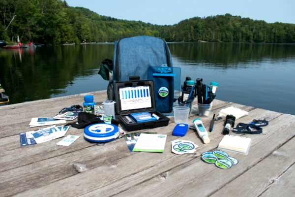
Water Rangers education kit
Do you have your Education testkit?
All materials for outdoor activities can be found in the Water Rangers education testkit.
Education testkitAlways refer to the safety tips in your educator’s guide, as well as our testing location guide and general tips for choosing a sample location when testing outdoors.
How to use Water Rangers Education Testkit
Steps
Observations
- Share information about the waterbody where you are located. Ask students if they know any facts or what they would like to discover during the testing.
- Encourage learners to observe their surroundings.
- What do they see/notice?
- What sounds do they hear?
- What do they smell from where they stand/sit?
- Note any types of human activities that may impact water quality.
- Encourage students to ask questions and make initial observations about the environment.
Recording water quality parameters
- Refer to your educator guide, Education Testkit information page, or watch the video above to learn how to use your kit. Instruct students on how to use the testing equipment for measuring air and water temperature, pH levels, and conductivity.
- Guide students in recording the data accurately in their notebooks or data sheets.
- Ensure students follow proper procedures for testing each parameter to obtain reliable results.
- Have students share in their groups and as a classroom their observations of their data and surroundings.
Discussion questions
- What differences did you observe between the air and water temperature readings at the testing site?
- What insights can be gathered from the measured values of water temperature and dissolved oxygen, considering their relationship?
- Can you identify any human activities near the testing site that may contribute to the conductivity levels recorded?
Suggestions for enrichment: In-classroom data upload
Teacher tip
Our kits are a great shared resource between classes. By forming a school group on the platform, all teachers can be members and store data for comparison, establishing trends, and fostering collaborative analysis!
When students return to the classroom, you upload the data you recorded as a class onto our data platform.
- Head to our data platform and create a monitoring group for your school. Present your screen to the class for a collective data upload session.
- Each group can call out the data they recorded for each parameter (air and water temperature, pH, conductivity) and calculate the class average together.
- You can also use the notes section to record their qualitative observations and upload any photos you took of the site!
Ocean connections
Explore Ocean Networks Canada data dashboardsReal world connections
The Sharbot Lake Water Monitoring program is a dedicated group of people who either live or have cottages on Sharbot Lake. As part of the Ontario150 project, they were one of the 17 recipients of testkits given to community groups across Ontario. Back in 2017, Water Rangers had the opportunity to join them on an excursion and learn what makes them such a strong team!
Read their community spotlightDownloadable resources
Data to the rescue – Presentation
Data to the rescue – Student handout
Data to the rescue – Teacher guide
Glossary
Average: The average is a way to find the typical value in a set of numbers. It can be calculated by adding up all the numbers and then dividing by the total count of numbers.
Bar Graph: A graph using bars of different lengths to compare data categories.
Climate Change: Long-term changes in Earth’s temperature and weather patterns, mainly due to human activities that increase greenhouse gas emissions.
Dissolved oxygen: the amount of gaseous oxygen dissolved in the water. Oxygen gets into the water in various ways, including absorbing it from the atmosphere, by rapid movement of the water, or as a product of photosynthesis.
Histogram: A graph showing data in bars of different heights to represent frequency.
Mean: The mean is a way to find the average of a set of numbers. You calculate it by adding up all the numbers in the set and then dividing by how many numbers there are.
Oceanography: The study of oceans, including their physical, chemical, and biological properties.