Introducing… Points of Interest!
We’re experimenting with a new feature called “Points of Interest”.
It’s a way to compare data before and after a point of interest, whether it’s a wetland that’s improving water quality or a potential pollution source. This project is being launched as part of the amazing innovative project that we’re doing with the River Wey Trust and Godalming Town Council, which also included the ‘catchment snapshot‘ that happened in March, and the launch of the Godalming Water Quality Hub, which is happening tomorrow! Thank you to Godalming Town Council for funding this prototype feature on our website and the River Wey Trust for their continued collaboration.
Our dream
This is a prototype! For now, many of the interactive components that guide users through helping them set up sample locations will be done manually as we apply for additional development funds. We’re hoping it can also highlight how restoration has improved water quality.
This feature is just a taste of some of the ideas we have to help groups set up meaningful water monitoring programs!
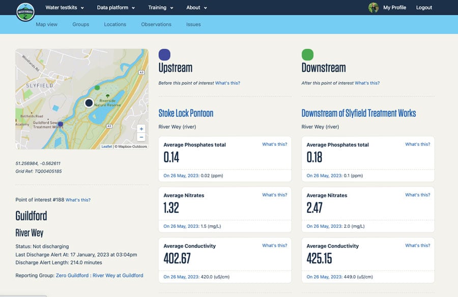
Our first integration is with the live data provided by Thames Water API on outflows in the southeast of England. We love Thames’ innovative live data map that lets us know where outflow locations are and when they’re discharging (including the length of time). Their API allows us to update this data on our website, and then we’re layering in water quality data to compare results upstream (before) and downstream (after) each point. Our goal is to help communities better understand the nuances of water quality by seeing the results next to one another.
A lot of the data we collect is to provide baseline water quality data at locations throughout the catchment. As part of this work, we’re also working to gather data to determine areas that would benefit from interventions and community support.
Using the map
- Go to app.waterrangers.ca and turn on ‘Show points of interest’ on the top left.
- The map will show you all the outflow locations as small navy dots.
- Those with upstream and downstream locations will appear as bigger blue dots outlined in white.
- Zoom into the point of interest navy dot with the circle. You’ll also see nearby green popups, which are the water sampling locations.


Viewing the data
- You can view the Godalming and Guildford outflow locations, with defined upstream (purple) and downstream (green) sample locations! Testers have been consistently monitoring these locations over the past year.
- On the left, view the latest outflow data, updated every hour from Thames Water.
- On the right, view the averages and the most recent readings for phosphates, nitrates, conductivity, and, if tested, e.coli. You’ll also see a qualitative report, notes, and the latest photos. Click on the two locations to see trendlines for those individual locations.

More to come
All locations from Thames are on the map, but only those with defined upstream and downstream data show a comparison. You’ll notice a Google form on the other locations to help us start to fill in some gaps. Groups that are testing in the River Wey Catchment are helping us determine which existing spots are good testing spots for outflows.
Like every prototype, we can’t wait for people to use them and help us learn. We’ll be applying for additional funds for a more integrated project based on what we learn from this, so stay tuned!
Thanks!
A special thanks to Godalming Town Council and the River Wey Trust for collaborating on this project, for the benefit of their region and beyond!
Shout out to our developer Elliott Draper for working with a prototyping budget to roll this feature out quickly 🙂